SettingBlock
SettingBlock is a component that displays a setting block which usually contains a couple of list items.
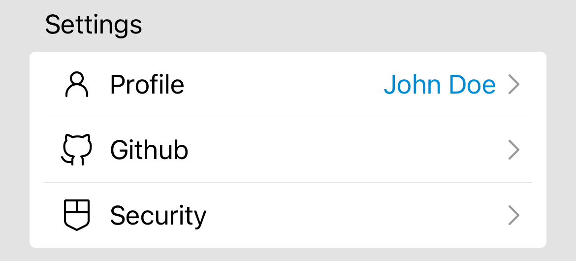
Preview
Usage
<SettingBlock
  title="Settings"
  items={[
    {
      icon: <User width={24} height={24} color="black" />,
      title: "Profile",
      value: "John Doe",
      onPress: () => {},
    },
    {
      icon: <GitHub width={24} height={24} color="black" />,
      title: "Github",
      value: "",
      onPress: () => {},
    },
    {
      icon: <HistoricShieldAlt width={24} height={24} color="black" />,
      title: "Security",
      value: "",
      onPress: () => {},
    },
  ]}
/>
Props
title: The title of the setting block.items: The items to display in the setting block.icon: The icon to display.title: The title of the item.value: The value of the item which is optionalonPress: The function to call when the item is pressed.