Button
Button is Button.
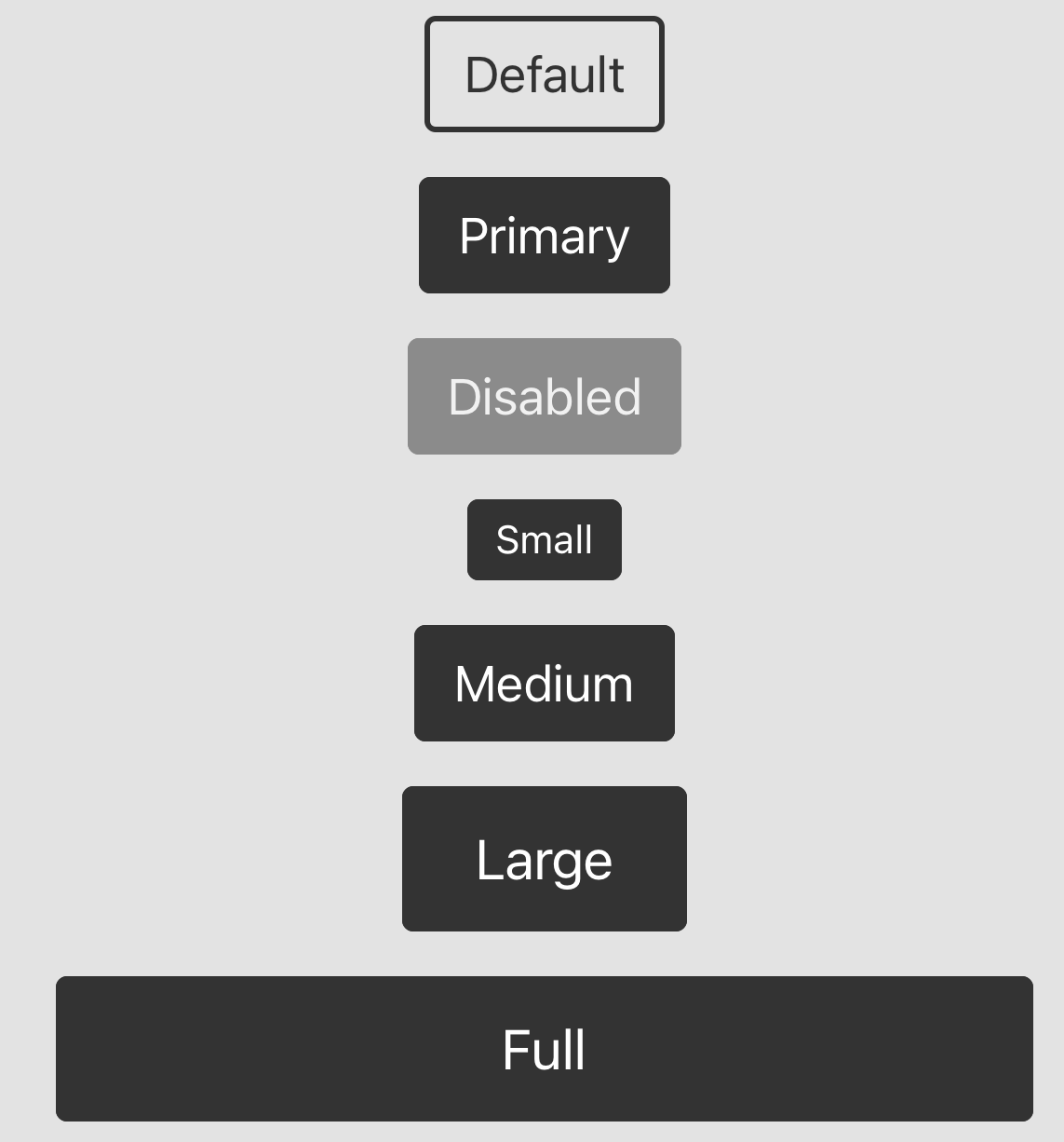
Preview
Usage
<Button
  label="Submit"
  primary
  size="large"
  disabled
  onPress={() => {
    console.log("Pressed");
  }}
/>
Props
label: The label of the button.primary: Whether the button is primary.size: The size of the button. Can besmall,medium, orlarge.disabled: Whether the button is disabled.onPress: The function to call when the button is pressed.full: Whether the button's width as long as parent.style: The style of the button.type: The type of the button. Can bedefaultorprimary.backgroundColor: The background color of the button.